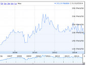
Hans Rosling is a doctor, academic, and statistician and in order to improve the presentation of his work into diseases in remote world regions he invented a new way of dynamically presenting data - Trendalyzer. We have used this here to present the vintages which go to make up Lafite in the FWAI50 in a more dynamic chart and hence the title 'Lafite on the move'.
Lafite makes up some 27% of the FWAI50 so it is interesting to consider the wine on its own given the significance of the data which it contributes to the FWAI50.
Please go ahead and trial as many facets as you have the time for. Here are just a few things you can do:
* alter the timing of the playback;
* change the axes;
* add a flag to the wine you are most interested in;
* add trails;
* Hover over a bubble to see to which wine it refers;
* By running a sequence using the same values on both axes you can visualize the impact of only one factor.
What can one learn here - apart from what fun it can be just pushing a few buttons? Well, it is interesting to see just how adventurous the 1982 has been especially in contrast to so many other terrific vintages. Arguably the 1989 and 1990 are as good. This demonstrates the degree to which a wine can attain a cult status over and above any qualitative considerations. Another aspect which becomes only too apparent (it helps if you assign the number of bottles sold to the 'Size' factor of a bubble) is that the more wine sold at auction, the more expensive it becomes. Now this might seem to be contradictory given that rarity is so often given as a prerequisite for improving values. On the other hand it might better reflect that wine is often sold at auction by a seller who is conscious of improving values.
Another interesting sequence requires some fiddling with the axes - assign 'Total auction $' to the 'Y-axis' and 'Annual # bottles sold' to the 'x-axis'. For 'Size' use 'Av. 75cl value $' and in 'Colour' use 'Annual # bottles sold'. This gives a very good representation of how the 1982 vintage has vied with the 2000 for popularity but still 2000 has never quite managed to equal the value of the 1982.
Please leave comments and suggestions as to other potential uses relevant to this particular study, and wine in general.

